Friday, 21 November 2014

Monoprinting

How to create a mono print!

Equipment :

  • Caligo relief inks or Block Printing Inks 
  • Working surface which is a thin plastic sheet 
  • If printing with plastic sheet the Albion and Etching press can be used.
  • Drawing, mark-making equipment such as biros, paintbrushes, sticks, cotton buds and a pencil.
  • Roller for inking
  •  Paper; newsprint, brown paper, copy paper, sugar paper and cartridge paper for printing. 
  • Newspaper to lie on top of tables. 

 Cleaning up:
  • Soap and a sponge
  • Use water for all caligo inks. 
  • Ventilate room and store all books and bags under tables. 
  • You may wish to wear gloves, this prevents skin contact with inks and cleaning materials. 


Method 1 : Reductive 

This is the easiest way of making a mono print you have to re roll the ink after each print. Rememeber doing a print this way will reverse your image.
  • Roll ink thinly onto a sheet of plastic 
  • Draw into the ink with mark making tools 
  • Place plastic under blankets on Etching press, place paper and print. (Always check pressure before printing) 

Method 2- Drawing onto the back of the paper.
This method creates a better quality of line, it is particularly suited to hand drawn typography, life drawing and still Life. 
  •  Roll out thin layer of ink, it is important not to use too much. 
  • Lightly place paper over the ink. (Try using different types of paper) 
  •   Draw onto the back of the paper with your drawing tools, some of these could be, biro, finger, stick, etc. The pressure will transfer the ink onto the paper 


Monday, 17 November 2014

Filters in Photoshop

Filters


Here are my twenty examples of filters, I used the same image and just changed the filter and on some of them I adjusted the sliders to create more of an effect.
 
Firstly make sure your you have selected the layer, chose a filter from the submenus in the filter menu, you can adjust the effect by changing the positions of the sliders.


Monday, 10 November 2014

Chemigrams
Create a normal photogram but when it comes to the processing process it is different.
1. Dip paint brush in to the developer and paint/flick the developer on to the photogram or picture, shake of excess.
2. Carefully place in the stop for 30 seconds then in to the fix for 5 minutes and then in to the stop so this effect remains on the picture.

Light painting artist research

Toby Keller

Keller lives and photographs in Santa Barbara, California.

Toby is a self taught photographer, he specialises in light painting photography. Keller uses streaks of light that combine with the landscape making his work rather interesting as it is a mix of photography.

Light painting is a technique in which photos are made by moving a light source while using a long exposure on the camera to capture an image.


I love this piece of Toby Keller's work as the background is very nice on the eye and he has used light painting to highlight on the main focus on the picture.

Pablo Picasso


Born in southern Spain Malaga on October the 25th 1881 and died on April the 8th 1973.

Picasso exceled in all subjects including
painting, sculpture and print making.

Picasso was probably the most famous figure in art in the 20th century. Before the age of 50 the Spanish born artist had become the most well known name in modern art suggesting to you how popular he was.
By the age of 13 you could tell he was going to be successful artist. At the age of 14 his family moved to Barcelona and he applied for the School of Fine Arts and his entry exam was so  extraordinary and he was granted with an exception. He soon began to skip classes to roam the streets and sketch the city.

At the age of 16 he moved to Madrid to attend the Royal Academy of San Fernando. Once again, Picasso began skipping classes to wander the city and paint what he observed from beggars to prostitutes.


Here is an example of Picasso's light paintings similar to his other paintings and work which are very abstract. Looks like a pot of flowers to me.

This piece is looks a like to his other work would you agree?

I absolutely love his work he expresses his thoughts and feelings through light painting.


Man Ray

Man Ray was born on August 27th 1890 and died on the November 18th 1976.

He was an American modernist he spent most of his life in Paris, Paris played a huge part in his work. Also his worked was highly influenced by the dada and surrealism period.

His worked ranged from painting to printing to photography but he was best known for photography. He was renowned for for being a fashion and potrait photgrapher. Also noted for photograms he called them "rayograph"
 
I absolutely love his photograms as they are very different from each other. Also they all stand out and catch your eye due to the contrast.
The camera photogram is my favourite one as it shows pictures on the film also the layout makes it more interesting! Also creates a sense of movement
This is a photogram that Man Ray created, I think this is rather interesting as the layout makes it more interesting also the tonal colours are very nice. Maybe this was a running theme as Moholy-Nagy produced a similar piece to this.
This is another example of Man Ray's photogram, I love the lay out of this one with all the different objects.

László Moholy-Nagy

Moholy Nagy was born on July 20th 1895 - November 24 1946.

He was a Hungarian painter and photographer also he taught as a professor in Bauhaus. He was highly influenced by constructivism a 20th century art movement. He later added 'Mohol' to his name, this is where he grew up in Hungary.

This is one of Moholy Nagy's paintings.

Throughout his career he became proficient and innovative in the fields of photography, typography, sculpture, painting and print making. His main focus was photography, he termed it "new vision" for his belief that photography could create a whole new way of seeing the outside which the human eye could not.

He experiment the process of exposing light sensitive paper with objects over laying it called 'photograms' an example is pictured below.
 
Similar to Man Ray's photogram this photogram creates a sense of movement by the layout and the tonal range is very good as you can a variety of colours. I like Moholy-Nagy's work and I believe it is very influencing towards my photograms.

Friday, 7 November 2014

Photography equipment for Hi and Lo key

High key and Lo key


Low Key: 
A Low Key image is one that contains predominantly dark tones and colours, low-key lighting creates striking contrasts through reduced lighting. Shadows are now the primary element of the composition. I had it in on ISO 100 this produces a high quality image. I had a 50 mm lens and an extension lens which was 20mm. I had a black background this produces a lot of shadows. The aperture on the camera and the lens was on F16 and the light was F22 with 1 stop on the light camera. I also set the focus ring to infinity to infinity. When focusing my image I had to move the camera in and out.

High Key:
Hight Key is where the light is predominate opposite from low key. I had my camera on ISO 100 this produces a high quality image. I had a 50 mm lens and an extension lens which was 20mm. I had a white background this produces a high dominance of white. The aperture on the camera and the lens was on F16 and the light was F22 with 1 stop on the light camera. I also set the focus ring to infinity to infinity. Same as the Low Key I had to focus my camera by moving it in and out.

High Key
Low Key


The ISO was on 100 for both high and light key this enables me to get a quality image. The shutter speed was on 1/60th of a second and on F16. I had a 50mm lens with a 20mm extension leads on F22. Also the lights were on 1 stop and F22.

Health and Safety

The lighting could be a health and safety risk if you are epileptic, wires as you could trip over.


How to create a photogram!

Black and White Photograms 

Photograms are a 1:1 print this means it is directly placed on top of the photographic paper and is the same scale. Each image produced is unique meaning that it cannot be reproduced because it is made by exposing light to the photographic paper.

Some objects used block out the light completely for example a tennis ball this is because the light cannot penetrate the surface, others create shadows for example a glass bottle.


We had to use the Darkroom which is a room that is blacked out so that no light is exposed to the piece of photographic paper which could ruin the photo.


Firstly I turned on the enlarger ready for my photograms. I adjusted the height of the enlarger head to ensure light covers the printing area (A5). I then changed all the colours to 0 (CMY), set the aperture to f/8 and the timer to 3.0 seconds (using the yellow buttons at the top of the square box to change the time). 
I then collected a thin strip of photographic paper (Kentmere) for a test strip and then placed the paper, shinny side up on the surface and placed some of my objects on top of the paper for my test strip. I then exposed the test strip for 3.0 seconds, I then covered the test strip up   with card and did this four times. So then I could roughly see how long I would have to expose it for.I then processed my test strip in chemical baths. I put it in the Developer for 2 minutes the chemicals in the developer react with the silver halide on the film, to change any silver halide that has been exposed to light to metallic silver `which reveals the shapes on the negatives Areas that receive more light become blacker when developed. Areas that receive no light stay clear.
  1. In to the stop bath for 30 seconds, the stop bath is an emulsion downed chemical mix which stops it from over developing. It washes off the developing chemical, but it continues to develop but at a very low level.
  2. Then I put it in the fix for 5 minutes. The fix has to remove the remaining silver halide grains from the Kentmere paper or it will destroy the picture and eventually become black.
  3. 10 minutes in the wash which removes all the chemicals so my picture will become permanent.
  4. Then in to tray and had to dry it off using the negative dryer (Illford 1250 RC) . I then looked at my test strip for the different exposure times to see which one looked the best. The first light section represents 3.0 seconds and 6.0 seconds, 9.0 seconds and 12 seconds. I could tell by the fade and I was looking for the first solid black. 
  5. I then returned the test strip to the fixer for it to carry on developing and set the enlarger timer to the final exposure time which was 7.0 seconds. 
  6. I then had an A5 piece of Kentmere paper and put all of my objects on the paper and payed around with the composition then exposed the final image and processed it in the chemicals following the same method as i mentioned earlier and used the same time. Then dried the print.

Health and Safety 

When I am in the dark room I had to wear gloves and googles to stop irritation from the chemicals on my skin. Wash yourself with cold water if any chemicals come in to contact with you. Also clear up any spillages of the chemicals and any glass objects that are broken. 

Sources :
https://answers.yahoo.com/question/index?qid=20111207150043AAY0eX3

How to create a sun print!

Sun print 

A sun print is a contact print (1:1) meaning that the print is the same scale . It is made by putting objects onto light sensitive paper and exposing it to the sun light. When exposed to light, the solid objects stop the light from exposing the paper. Any object that the light can pass through will produce a pattern. Each image produced is unique, because it is made by shining light on it.

I had a piece of card, piece of glass, photographic chemicals and a piece of photographic paper (kentmere).


I used a leaf for my sun print which I found on the college site I then went back to the dark room, put my leaf on the photographic paper and placed my black piece of card on top (to stop the paper being exposed to light, which would ruin the picture) with the piece of glass on top. I then found a sunny spot and placed my piece objects on the floor. I removed my black piece of card and exposed it to the sun light with the piece of glass on top of the leaf for 5 minutes (till I saw an imprint) . Then placed the piece of black card back on top to stop it being exposed to the light and went back to the darkroom.


I firstly placed it in the developer then the fix and the stop then cleaned it off with water and then dried it. It came out very well as you could see the tiny patterns on the leaf also the tonal colours were brilliant.


Adobe Illustrator

Adobe Illustrator

I was learning how to use Adobe Illustrator and in Adobe I was learning how to use the shape, line and pen tools, also how to use the layers work also how to use opacity.

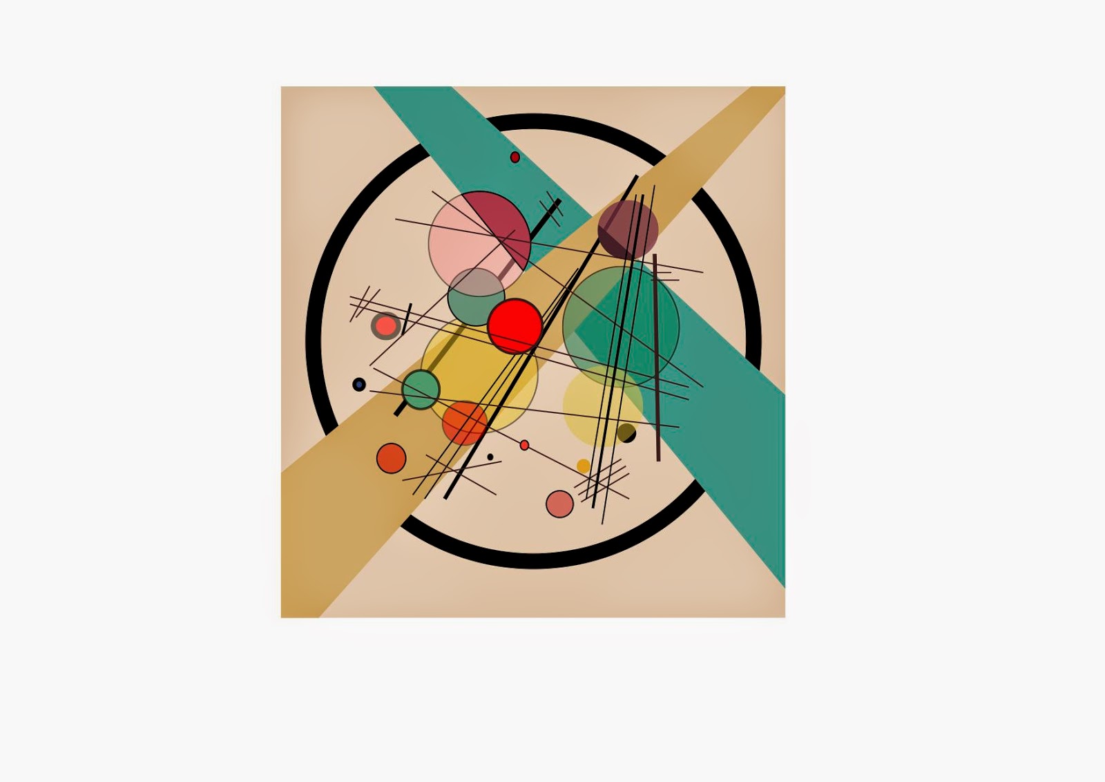
I was recreating a piece of Kandinsky’s work. Pictured below is Kansinsky's work and my recreation.

Kandinsky's work.
This is my opacity one, you van see within the circles how I have changed the opacity, I like this one as you can see everything and I think it works well.

Here I have left the opacity at 100%, it now looks much more bolder and stands out.


 1. Firstly I created a paper size 297 mm x 210 mm.
2. I had a picture of Kandinsky's work and copied his objects and I used the eye within the layers pallet to see what I had missed so then I can create the objects/ lines.


3. I used the layer tool to position the objects. For example the beige coloured stripe is in front of the blue as you can see pictured. So the beige stripe would of been positioned at the top in the pallet of my layers with the blue one being below. You can click on the eye ball so you can remove the layer also you can lock it so you cannot edit it.

4. I changed the opacity by clicking the setting in the bar changing it from 100% opacity to 60% you can see the difference within my images. This means that you can see behind the object where as before you couldn't.
 
  • I used the pen tool to create the black lines and the beige and blue stripes. I created the black lines by pressing the left button on one point and clicked it again where it ended then clicked the black arrow to stop using it. I also made some lines bolder then other by increasing the stroke of the line. 
  • I created the stripes by clicking on the corners and connected them together making it an object then filled it with colour.
  • I created the circles using the elipse tool, I used the eye dropper tool to pick up the colours so they were the same.


Pen tool: The most powerful tool in illustrator, can be used to create countless lines, curves and shapes, curved lines and straight lines. Serves for the building block for illustration and design. The pen tool is used by creating anchor points and by connecting those points you create 'lines'. The pen tool has unlimited possibilities the pen tool is found in the toolbar.

Shape tool: From rectangle to stars their is a wide range of shape tools. To create a shape all you have to do is drag the shape diagonally to your desired size.

Eye dropper tool: You can sample colours from your art work

Colour panel: You can create inverse and complementary colours for the current fill or stroke colour, also create a swatch from the selected colour.

Colour guide panel: Provides several harmony rules to chose from by the colour you have picked. You can create variations of shades, tints, warm and cool colours, or vivid and muted colours.
 

Pictured above are all the tools I used.

3 Key Elements in Photography

There are 3 Key Elements in Photography for capturing a good picture.

Firstly you have to use manual mode on the camera.

Shutter speed

Shutter speed refers to the length of exposure. This is how long the lens is open to record an image.

Aperture 

Aperture, refers to the opening of the lens which light passes through. Aperture is measured in F stops.


The lower the f/stop - Large aperture - Less depth of field
The higher the f/stop - Small aperture - Greater depth of field =

ISO 

 ISO, is the quality of the image.

Image Trace

Image Trace 

Martyn taught me how to use image trace in Adobe illustrator. I firstly scanned then selected overview and select then scanned my image in to Photoshop at 300 pi.


I changed the levels of the image to create a more clear image also cropped it, saved it as a jpeg. I then put it into adobe illustrator. I created a 210 mm x 210 mm file and placed my image in to my work. I then traced my image and limited it to three colours and expanded it and edited thde colours and copied it and paced it 4 times and this is my outcome.
I think it looks very good due to the contrast next time i will make the outline a tiny bit more bolder.

Sandwhich Printing

Sandwich Printing

Sandwich printing is a technique that takes place in the dark room. It is created by placing two negatives in to the film carrier of the enlarger. You gave to make sure you focus it by using the focus knob how ever both images will not be focused as they are both different from each other. After focusing as usual, you will make test strips to find the best time for the picture. You would then repeat the same process as a normal 'photogram'. 

Here is a picture of the enlarger, as you can see the film carrier with the film in. How ever you will have to place 2 instead 1.
Here is an example of sandwich printing. I think this image looks really good as it is a lovely composition maybe this is something I could experiment with?


Sources : 
http://www.venicearts.org/index.php?view=library&item=17311

http://upload.wikimedia.org/wikipedia/commons/thumb/8/8b/Darkroom_enlarger_en.svg/2000px-Darkroom_enlarger_en.svg.png

https://m1.behance.net/rendition/modules/106361873/disp/040fbba0f6c99ad03b54404a65b10518.jpg

Portraits

Portraits

This is before I edited my picture using Photoshop.
This is after I edited my image, I think it looks more serious now and gives off a very serious effect making the viewer believe it is sombre mood.
I used the contrast levels to create this effect, I changed the positions of the sliders until I was happy.


Here is the image before I edited it. I believe it is already a very serious photo before I even edited it as his facial expressions give of a serious tone.
Here is the image after I edited it, it looks even more serious now making it even more dramatic.

Same again I used the exposure levels to change the contrast.


Here you can see the unedited image and can see the creases in my jacket.
This is my edited image, you cannot see the creases in my jacket now, same as my other images It gives of a sombre effect.


Here you can see the black and white levels.


This is my unedited image pictured above. 

Here is my edited image you can see my hair, parts of my face and my jacket look much darker now. Also the background does too.


Here is the black and white levels.

Processing film

Daylight developing tank 

1. Firstly you have to use a film retriever to extract the film. Then open the top of the film with a pair of scissors inside the double layered change bag.

2.  You need to put the tank body, centre column, light tight funnel lid, plastic cap, film and spiral inside the change bag.

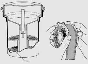
3. Pull all of the film out of the cassette and feed the end of the film on to the spiral. This requires a little patience. Try not to get your finger tips all over the film as it shows up when printing. The spiral has 2 large on the inner side of the plastic and 2 small notches opposite. Align the two larger notches and pass the film just under those notches. Hold the spiral in your left hand and place your first and second fingers on top of the two large notches and turn clockwise and with your right hand twist anti clockwise  very slowly (remember this is in the dark) until all the film is in the spiral.

4.Slide the spiral containing the film on to the centre column and add another loaded or empty spiral on top. The column  must be full before placing the connected spirals into the tank body. If you only have x1 film, make sure the film is on the bottom spiral to ensure it is processed when chemicals are added later.

5. Once the centre column and spirals are positioned within the tank body, secure the funnel lid by twisting and locking in to place. At this stage it is always a good idea to hold the tank by the lid to ensure it doesn't come lose.

6.Your film is now in a light tight container and ready for the chemical process. Do not remove funnel lid until all stages of  development are complete. Any exposure to light will destroy your film. 
               When processing two films you have to use x2 the amount of chemicals.

Pictured to the left is the developing tank and on the right is the column with the film around it.

Health & Safety 
  • If you spill any chemicals make sure you clean up the area.
  • Make sure you wash your hands or body if you come in to contact with chemicals.
  • If you break the glass inform your lecturer or teacher.


Shutter speed

Shutter Speed

What is Shutter Speed?

Shutter speed is ‘the amount of time that the shutter is open' while taking a photo.

Shutter speed is measured in seconds – but most of the time it is in fraction of seconds. 


Slower                                                                      Faster
1/2, 1/4, 1/8, 1/15, 1/30, 1/60, 1/125, 1/250, 1/500, 1/1000
When using a shutter speed of 1/60th of a second or faster you will probably get camera shake (this is when your camera is moving while the shutter is open and this results in a blur) and is very difficult to use. When using a shutter speed of anything faster then 1/60th of a second you will need to use a tri pod to stop camera shake.
Here is where I experimented with shutter speed this image had a 20 second exposure.

Wednesday, 5 November 2014

Photoshop Adjustments

Photoshop Adjustments

Exposure

This photo picture above is before the adjustments.
This photo here has been adjusted using photoshop layers, I clicked on new layers, adjustment layers and clicked on exposure and used the histogram to change the exposure levels.
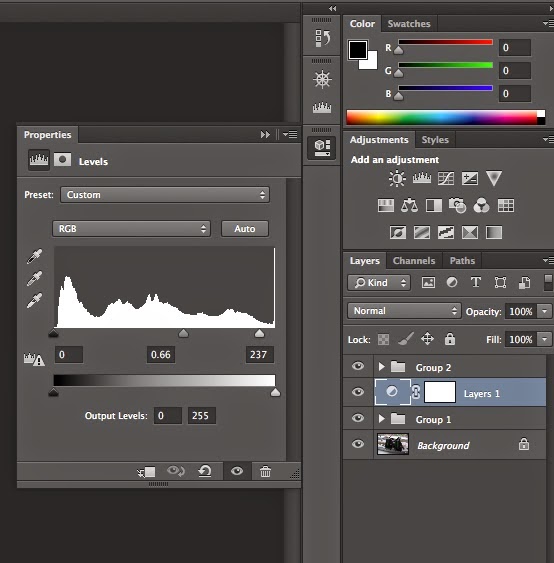
Here is my histogram, it is perfectly exposed as I have a full tonal range because the black arrow is touching the end same as the white arrow. You will have to adjust the arrow if they are not touching the end to get the correct exposure.


 Black and White

This is my photo before the adjustments.
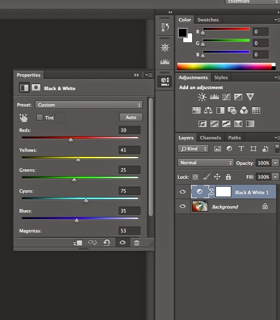
This photo here has been adjusted using photoshop layers, I clicked on new layers, clicked on black and white layers then I adjusted the property sliders to adjust the colours of it.
Here is the property sliders as you can see the different colours you can adjust, I played around with all of them to see the different colours and to see what came out best.
 
 
Selective Colouring

 This is my photo before editing.
 This is my photo after editing.
 I used the paint brush to paint the image and select the colour I wanted in my image, as you can see i left the bottle.

Brightness and Contrast 

This is my original image.
 This is my image after editing with contrast at the highest value.
This is my image after editing with the contrast at the lowest value.
 To adjust the contrast all you have to do is adjust the slider.

Cropping
 This is my original image.
 Here I have cropped it 9x6.
Here I have cropped it 1x1.