Tuesday, 15 December 2015

Theresa Jackson Lesson - Equisite Corpse

Equisite Corpse
Here I have used photoshop to create an exquisite corpse 

I used the colour range and clicked on the background and then added a sample using the paint tool, It then deleted the background.

Using the magic lasso to cut around the legs to make sure they look good and sharp.


Jamie Reid Screenprint collage artist - Surrealism

Screen Printing

equipment needed; spoon, acrylic paint, acrylic medium, squeegee, packaging tape.

The screen is made from a fine mesh material which is fixed to a metal frame. A stencil is placed under the screen and ink is forced through the stencil on to the material below. Screen printing with stencils is best for blocks of colour.

Firstly your positive film positive used will be exposed and will harden the light sensitive emulsion on to the tight fabric which is already on the metal frame, then you have to tape up all the yellow areas and the sides of the metal frame. Once you have done this you can then put your mix of acrylic ink with acrylic medium on to the top of the frame and then squeegee the ink across the screen stencil forcing the ink through the open areas, then lift your frame back up and squeegee ink back across to keep the screen wet otherwise it will dry up.

Raoul Hausmann - ABCD

This piece "ABCD" was completed by Raoul Hausmann in 1923/1924 this piece is a collage and photomontage on paper and is 40.4 x 28.2 cm. Haussmann was one of the leading men of the Berlin dada art period, Raoul Hausmann is attempting to distort the image by adding a variety of different pictures in.  Housman is also being very expressive because it just looks very unusual and looks like Hausmann has just sticked '        '  images on the collage. I think Hausmann worked from imagination  and using found imagery fro different sources. The work makes me question what the artist is is trying to achieve because it doesn't make a lot of sense. The artist has sed very dull colours , reflecting the time that the art was produced as such Hausmann appears to have little choice about the colours he has used. Raoul was part of the surrealist movement so this would have influenced his work, I like this piece because it has no meaning therefore you are forced in to asking yourself questions also the use of juxtaposition works well.


Raoul Hausmann has a very antiquated style you can tell by the colours of the piece "ABCD", the colours are very dull in this piece so this where as the colours of my work are very bright and vibrant due to me taking my pictures out of a magazine . Both mine and Hausmann style is "cut and paste" his work is very surrealistic where as mine isn't very surrealistic.


You focus on the face first as this is biggest part of the artwork, also the colours play a part as you focus on the big black writing on the orange background, isn't very realistic as it looks like the photos and letters have just been stuck on.

Sally Stone - Darkroom - Surrealisim

Dark Room recap; Ensure hands are clean, ensure negatives are clean, set masking frame to appropriate size, leave 1/4 gap around all sides for example a 7" x 5" would be 6 1/2" x 4 1/2". Then load your negative in to the film career shiny side up! 0 on all the dials magenta, scan and yellow, set the F to the brightest F, then use the focus finder to focus, then carefully turn F down 2 steps, carry out a test strip to determine the exposure by doing 2 seconds all over and then using the card to cover up horizontally or vertically and do this till your test strip is all done.

Reasons for making a test strip: to save money on photographic paper, to determine the exposure time therefore saves you a lot of time as you do it all on one piece of paper.


Here is my original picture a nice use of tonal range although if i was to do it again I would make sure that the background had a different exposure time!
Here Man Ray has inspired me with the objects placed in my picture. the use of juxtaposition here makes the image much more interesting.
  1. Firstly chose your negative that you want to print (make sure it is clean, no scratches and no dust on it)
  2. Hold the negatives so you can read the numbers, then turn the negative round (not over) so the number is furthest away from you. 
  3. Place your negative in the film carrier in to place. 
  4. With a lens on full aperture, turn on the enlarger. Place a normal piece of paper on the easel and use the focus finder to focus the image (use the focus on the enlarger to focus the image).
  5. Change the aperture back to f8 to increase the sharpness of the image.
  6. If the picture looks flat increase the amount of magenta on the enlarger. 
  7. Produce a test strip (3 seconds for light photos & 5 seconds for dark photos), develop the test strip as normal.
  8. Then I placed my objects on top of my photo and turn on the enlarger for 6 seconds.


Screenpritning - health and safety - Surrealism

Screen Printing

equipment needed; spoon, acrylic paint, acrylic medium, squeegee, packaging tape.

The screen is made from a fine mesh material which is fixed to a metal frame. A stencil is placed under the screen and ink is forced through the stencil on to the material below. Screen printing with stencils is best for blocks of colour.

Firstly your positive film positive used will be exposed and will harden the light sensitive emulsion on to the tight fabric which is already on the metal frame, then you have to tape up all the yellow areas and the sides of the metal frame. Once you have done this you can then put your mix of acrylic ink with acrylic medium on to the top of the frame and then squeegee the ink across the screen stencil forcing the ink through the open areas, then lift your frame back up and squeegee ink back across to keep the screen wet otherwise it will dry up.

Wednesday, 30 September 2015

Pen tool and sketch - Graphics tablet

Here is my original image as you can see some of the outlines look darker then the others this is where I have gone over it.

Without the image you can see what i have accomplished. I think this looks very good and simple, aslthough does take some time, I will certainly be usin g this technique again.

Wednesday, 9 September 2015

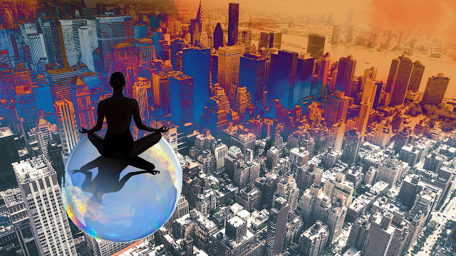
Surrealism workshop with Paul Parsons


Using the polygon lesson tool i started cutting shapes up and making them bigger and smaller by using the transform tool.

I did the same with the magic wand tool and pen tool to delete the background of the bubble, then I selected the gap between the women's legs and arms on layer 1 and then went on to the bubble layer and deleted the gap to make it look more realistic.

I then used one of my other images and blended it together by using the paintbrush set to 'clear mode' and then changed the settings to differences. Overall i am happy with my outcome and will be using what I have learnt again!

I added a shadow to make it look more realistic.
Using the star shape and the dash sign to create this, I love this as it look very surreal

 I then created 4 rectangles and coloured them in, I then blended it and changed the setting while using preview to see how it was going to look then I used the white arrow to make it curved as you can see to the left.
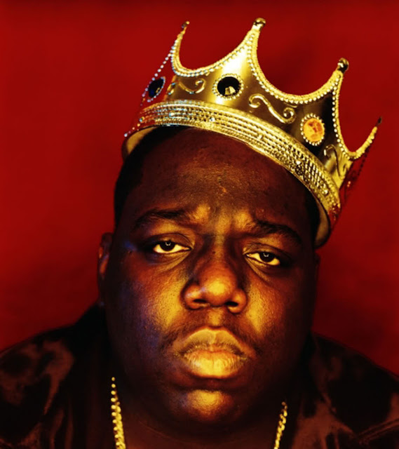
 I then  started another surrealism image using Biggie smalls
 I then used the magic wand tool to delete the background and the clone to make the sky look more realistic.
I then did the same again with the coloured lines by blending them, I used the motion blur to blur him but i did it just so you can realise who it is.

Monday, 8 June 2015

Photographers - Physcogeography artists

Hélène Binet


Hélène Binet was born in 1959 in Sorengo and is of both Swiss and French background. She currently lives in London. She studied photography at the Instituto Europeo di Design in Rome, where she grew up, and soon developed an interest in architetural photography.
Over a period of twenty-five years Hélène Binet has photographed both contemporary and historical architecture.  Hélène Binet is shown in both national and international exhibitions.
Black and White photography, very classic, has no time age, 
I like her series 'Tate Modern Construction, London, UK' Photographed in 1999. 
Here are some of the photos from this series:


This photo was completed by Hélène Binet in 1999, the picture is 
Of the tate modern museum during construction in black and white, a lovely photo.
I think the artist is trying to observe capture the surroundings. She has used a camera to capture this photograph. This work suggests to me that Binet is trying to capture the Tate modern when being built, not many other artists do this as its an unusual subject and often buildings don't look very pretty however in this case she makes construction look much more appealing. The use of composistion plays a big part in this photo and makes you focus on content rather then the colour. The use of black & white gives it a classic look even though the photo was taken in 1999 in 2015 the photo still look as good, I think Hélène has done this to make you pay more attention to the picture rather then the colour. The artists style is very classic and straight to the point, I can tell this by the rest of her pictures in the ‘1999 Tate Modern Construction’ I love her work because its very interesting due to the fact she has chosen to photograph this subject.


Daniel Hewitt 

Daniel Hewitt's architectural work is exciting because it is more than just photographs of buildings, He focuses on urban construction. Hewitt was commissioned in February 2012 by the McGee Group to document the concrete work for the Tate Modern Tanks. The lovely collection of photographs makes the the construction process look much more beautiful then normal, Hewitt finds beauty in moving I-beams and positioning of concrete pillars.

I love his series 'Tate modern Tanks' very similair to Binet's photographers however these are in colour, 


Before establishing myself as a photographer, Daniel spent just under a decade pursuing academic interests in philosophy, architecture, and law, specialising in the philosophy of architectural aesthetics.


Daniel's current work is divided into personal and commercial projects. Personal projects explore philosophical questions in architecture and the built environment. Commercial projects so far include documenting major buildings and construction sites in central London, such as Tate Modern, Bloomberg Square and Crossrail.

Pictured below is his series 'Tate Modern Tanks'  


Daniel Hewitt 

This photograph was completed by Daniel Hewitt in 2011, the digger is rthe man focus in the photo with a couple of builders around him  at work, with a glimpse of the normal world above the wooden barrier that’s separating the building site. I think Hewitt is trying to find the simplicity in the building site and from a different perspective it looks a more nice building site, a side that we don’t very often get to see. The reason I think this is because of the perspective he has used and the way he has used the camera to capture this photograph, a very boring picture but with the diggers and other equipment in orange and yellows make them stand out more so you pay more attention to this then you normally would.
 The source of inspiration would of come from his personal interests in architecture. This piece makes me want to go out and find the nearest building site and take some photographs of the construction. The use of composition in this photo is very nice as the wall in the background makes you move your eyes around the photo just like the walls movement. The artists use of mm on his camera suggest that he wants to you to pay attention to everything in the photograph. I think he has done this to catch the eye of people. The artists style is very nice as the use of colour catches your attention, I know this because this is the effect the photo had on me. I love this piece of work as the building site which is normally an ugly view looks beautiful through this photo.


Sources; http://www.helenebinet.com/about.html
http://www.danielhewitt.com

Thursday, 4 June 2015

Final piece - Physcogeography

How I created my final piece for Physcogeography 

Firstly I put the picture of my chosen building in to Adobe Ilustrator.

Secondly I selected the layer and used the magic wand tool and selected the blue sky and changed the consistency to get it just right.

Then I deleted the blue sky so I only had my building left.

I then copied the layer because I was clicked on the background, I then duplicated this layer.

I then made it black & white and used the sliders to make the wall roughly the same colour.

Using the brightness and contrast, I changed the contrast to make the wall look roughly the same again.

Using the levels to make the colours within the picture roughly the same for my screen print.

Then I started duplicating my layer several times and rearranging each layer, i moved some layers behind them by using the layers toolbar pictured on the right, also making some bigger and some smaller.

And here it is my final piece ready for a screen print.


Photoshop

Firstly I inserted the image in to Photoshop, I then used the magic wand tool to get rid of the areas I didn't want so the sky and the tree, i changed the tolerance so I didn't delete any of the building. Then I selected the image and pressed inverse and then copied the image to an A3 template. 

I then started to copy the image several times and made the photo either bigger or smaller and used the shift key to make sure the image was done in proportion. I then made sure the images was behind each other so it didn't look odd. 

I then changed the contrast of the image to 100 and changed the levels and made it black and white and made sure all of the black parts all looked a similar colour to each other and same for the white parts. This was then ready for screen printing.

Screenprint

The screen is made from a fine mesh material which is fixed to a metal frame. A stencil is placed under the screen and ink is forced through the stencil on to the material below. Screen printing with stencils is best for blocks of colour.

Firstly your positive film positive used will be exposed and will harden the light sensitive emulsion on to the tight fabric which is already on the metal frame, then you have to tape up all the yellow areas and the sides of the metal frame. Once you have done this you can then put your mix of acrylic ink with acrylic medium on to the top of the frame and then squeegee the ink across the screen stencil forcing the ink through the open areas, then lift your frame back up and squegee ink back across to keep the screen wet otherwise it will dry up.

White gel pen

I then added white gel pen to my screen print which had a red graffiti background, I found it quite difficult to chose what parts to use the white gel pen on so with some experimentation I finally selected the areas I wanted to use the white gel pen on and went for it. I found it very hard because the white gel pen sometimes wouldn't go on the paper so then I went over it which made some lines thicker then others.

Review for camera - I used manual settings so I had more control over the camera rather then auto settings, this includes the aperture and shutter speed, I shot a couple of photos and adjusted the settings to what I needed.


Saturday, 16 May 2015

Presentation methods - Physcogeography

How would I display my work in a gallery or public space?

I would use the "framed textiles and prints"display method due to my final piece being a print also i think it looks the best out of all of them.


I believe this would be the most suitable method for presenting my artwork 
What do you think would be the most
suitable display method for your work?


Framed Canvas 
Could be a painting or a photograph on the canvas also due to it having no staples or any other thing showing it looks a very clean method and aesthetically apleaing 
Framed textiles and prints
Normally used for textiles and prints, a nice boarder around the artwork which gives it a distinct look and the frame making the artwork stand out giving it some contrast to the white boarder.


Flat wall mount 


Window Mount 
Another option which I could of used as my print would of looked nice in this method too.

Flat mount
You cannot see anything apart from the artwork which makes the flat mount admirable and simple.


Thursday, 14 May 2015

Creative Advertisement - Obeisty - Current News

Current News on unhealthy living 

Source; http://www.independent.co.uk/life-style/health-and-families/health-news/three-in-every-four-british-men-will-be-obese-by-2030-says-the-world-health-organisation-10227099.html


"Three in every four British men will be overweight by 2030, says World Health Organisation" 


Very interesting headline, made me want to read on and find out more about this issue, also a very surprising fact? Makes me worry about my self.

The fact is surprisingly disturbing which relates to the image "3 out of 4 men" & "2 in 3 women" are predicted to be overweight by 2030. Overweight people and obesity continue to grow, recent campaigns to improve diet, curb sugar and fat intake are not having an impact on people, this is very bad as it will only continue to get worse. UK will remain in the top 3 European nations in terms of obesity and overweight people. The article suggests maybe sugar taxes could have an effect? I believe it definitely would as I would not pay more money therefore going to make it work, also better labelling on foods would help people understand the calories they are eating.


Source; http://www.dailymail.co.uk/health/article-3069537/Women-s-obesity-timebomb-laid-bare-Two-thirds-overweight-2030-warns-WHO.html

Very similar to the other article above, they both talk about how bad obesity and overweight people are now and how bad it is going to get in the future, only 15 years time.

The article says its going to be a "crisis if not dealt with", "explosion" , "early grave" or "ill health", "simply easier to eat more and move less". The government must do more to improve this otherwise we will have to face the consequences. 

http://www.bbc.co.uk/news/health-32797769

Another article about obeisty found on the BBC  "They found a clear shift over time, with obesity becoming more common and starting earlier in life"

The data is a a good part of the article as the visual making it much more easier to understand therefore 


Spot colour + CMYK - Creative Advertisement

Here is a brief explanation of the differences and how each method is best used. The image samples used in this post show the basic difference between a 2-colour spot colour, versus a 4-colour (or “full color”) process logo. Although they look somewhat similar, they are very different in construction.

Spot Color printing

This type of printing consists of printing with 1 or more pre-mixed colors (generally 1, 2 or 3 colors at once). Spot printing uses a color system of solid, premixed colors known as Pantone colors.

Advantages:
When using spot printing, colors are more accurate because you have already determined the color by its specific Pantone number. Since the ink is not being mixed, that color will never change from one print run to the next. For example: a Pantone 186 Red will always be 186 Red. Some colors, such as metallics and fluorescents, are only available as spot colors—the same color and effect can’t be achieved using 4-color process.
Spot color is generally more economical if printing is kept to 3 colors or less.
Disadvantages:
Spot colors are nearly impossible to replicate on digital print devices, such as laser printers.

4-Color Process Printing

Process printing uses 4 colors which, together, are known as CMYK:
 Cyan
Magenta
  Yellow
  Black (also known as “Key”)
The combination of these colors, used on their own or overlapped with one another, will produce a full color spectrum typically used when printing photographic types of images, or graphics with lots of color depth.

Advantages:
If it takes more that 3 colors to achieve a print reproduction, than 4-color printing will probably be most economical. CMYK printing is the best method to achieve realistic looking photographs on a printed piece.
Disadvantages:

Since the colors are a mix of dots over other dots, there is a good chance color will vary from printer to printer and job to job.

Sources; http://www.visiondesign.com/2010/04/printing-cmyk-vs-spot-color/

Creative Advertisement - Company Logo's

Coroprate Identity - What is corporate Identity? 
corporate identity is the overall image of a corporation, firm or business in the minds of diverse publics, such as customers, investors and employees.

 Adidas 


The Adidas logo started out in 1949

"On August 18, 1949, Adi Dassler started over again at the 

age of 49, registered the “Adi Dassler adidas 

Sportschuhfabrik” and set to work with 47 employees in the

 small town of Herzogenaurach. On the same day, 

he registered a shoe that included the registration of the 

soon-to-become-famous adidas 3-Stripes. From humble 

beginnings to a global success story – which was 

accelerated by a miracle …"

Very modern at the time similar to Nike's logo but now looks very old fashioned and out of date, doesn't remind me a lot of their slogan "the brand with the 3 stripes", then updated to a more retro styled logo in 1971, this is my favourite Adidas logo due to its classic look also will stand out due to the nice use of contrasting colours, the monochrome colour theme is very simple and works well. Updated to a more modern styled Adidas logo to appeal to a younger audience in the 1990, same as the logo before lovely use of monochrome colours and the "original" 1971 logo is still in use as Adidas Originals. Updated again in 2005 I believe Adidas has taken a step backwards as this logo isn't as nice as the previous two, due to the layout.

"The Adidas logo looks like a mountain to represent the obstacles that people need to overcome. Originally the logo was just three stripes and didn't stand for anything. So they kept the three stripes and just made them slanted to resemble a mountain."

 Nike 


 The Nike logo hasn't changed a lot over the years, only 4 major changes to the logo.

Nike swoosh tick and font, I have never seen this Nike logo in my life, looks very old fashioned now (2015) but at the time it would of been very modern and would of stood out as not many other company's logos would of looked like this, the composition could of been placed  better as well as the font going through the tick doesn't work well.

1978; The big bold font grabs your attention and the Nike tick has been coloured in now, looks much more appealing now I believe and stands out much more due to its contrasting colours as they work very well together.

1985; The logo has now been reverted to a white colour and put in to a black square box, I like this logo still and you can tell it looks more modern now, it would of been fresh at the time.

The modern logo has been simplified, the logo looks more sharp now and doesn't have to have the name because the Nike logo is now a global logo and so recognisable all over the world.
"The company takes its name from the Greek goddess of victory, Nike. The logo represents the wing of the Greek Goddess"

 Coca Cola 

Coca cola, the brand has the privilege to be known all around the world as they have built their image on a universal value, based on happiness. The brand image conveyed, the visibility and availability of its products and ads, also the expected quality everywhere make Coca Cola one of the most bought brands in the world. 


"The red colour in the logo shows legacy."
Over the years the Coca Cola logo has changed a lot over the years from a normal styled font at the beginng and in the 1940's Coca Cola had its trademark style font, also introduced the colour red in the 1950's, consumers almost universally identify the very sight of red and white with Coca Cola. I personally think the 1993 logo is the nicest of them all with the bottle of Coke making it look realistic and the white font on top making it stand out.


Sources; 
http://popsop.com/2011/05/coca-cola-journey-to-the-roots-of-brand-

identity/http://softdrinkcolawar.blogspot.co.uk/2012/12/coke-brand-identity.html
http://en.wikipedia.org/wiki/Corporate_identity
http://www.investopedia.com/financial-edge/1012/the-evolution-of-the-coca-cola-brand.aspx
http://www.adidas-group.com/en/group/history/
http://www.lifebuzz.com/logos/3/
http://www.galakcious.net/2014/04/top-35-famous-logos-having-hidden-meaning.html#sthash.wvzg3101.dpuf
http://www.galakcious.net/2014/04/top-35-famous-logos-having-hidden-meaning.html